Table of Contents
Introduction
Stock market corrections always provoke questions, fears, and second-guessing—and rightly so. They unfold quickly, often stirring emotion from every corner: those who missed the rally and are desperate for better entry points, those under-invested and scrambling to catch up, and the perennial skeptics who insist that a rising market is “mispriced.”
Let’s start with that last argument. Markets are never mispriced. They reflect precisely what is known, believed, and expected at any given moment. You may think valuations are stretched or irrational, but that alone doesn’t mean prices must fall. Corrections and dislocations happen when something changes—typically something unanticipated that shifts liquidity, sentiment, or expectations.
In this case, the latest drawdown appears driven more by tightening liquidity than by fundamental deterioration. After a six-month advance, it’s perfectly natural for investors to view a pullback as “due.” But what that really means is that a relentless uptrend simply becomes more vulnerable when conditions shift.
Since the end of October, the S&P 500 has slipped just over 4%. That’s well within the range of a garden-variety correction—typically 3–5%—the kind of move that tends to happen three to four times per year. In other words, this isn’t abnormal behavior for a bull market; it’s the price of admission for staying invested.
(See the compiled data below on historical correction frequency since 1950.)

The bigger question, of course, is whether this marks the beginning of something larger. Given that markets have already endured a 15–20% correction earlier in the cycle, the odds of another major drawdown are statistically low—unless, of course, we’re witnessing the early stages of a genuine market top.
In our November 5th report, we highlighted how erratic movements in the REPO market were tightening liquidity and weighing on speculative assets—particularly crypto and other liquidity-sensitive areas of the market. We’ve also previously discussed the Secured Overnight Financing Rate (SOFR) as a critical barometer for short-term funding conditions.
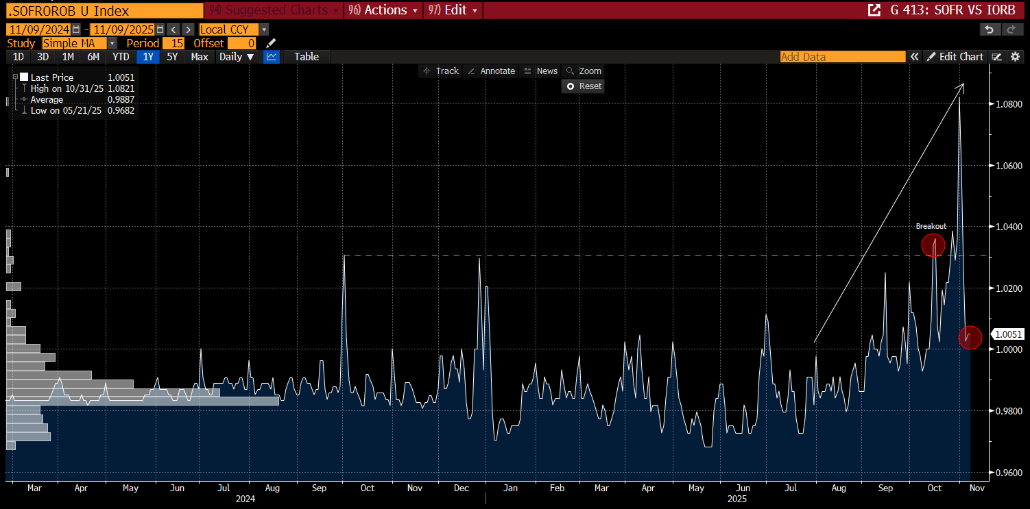
SOFR represents the cost of borrowing cash overnight using U.S. Treasuries as collateral. When SOFR rises, it signals tighter liquidity—cash is harder to come by. When it falls, conditions are easing. Importantly, SOFR has collapsed since the end of October, suggesting that short-term funding pressure has meaningfully eased.

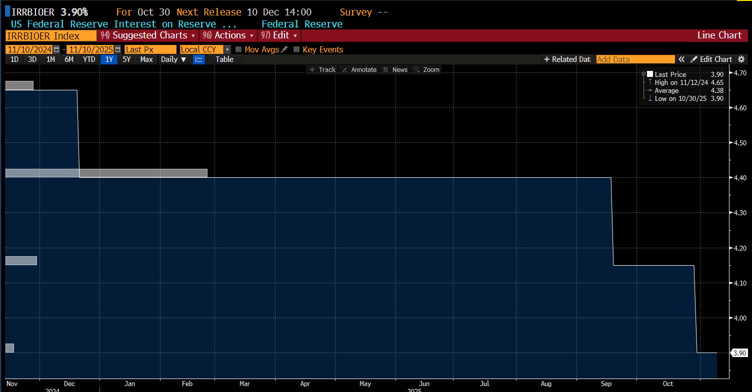
Taken in isolation, the SOFR rate can be misleading. It’s best understood in relation to the Fed’s Interest on Reserve Balances (IORB)—the rate banks earn on excess reserves parked at the Fed. When SOFR declines and stabilizes near the IORB rate, as it is doing now, it signals ample system liquidity. In other words, funding conditions have normalized, and the stress observed in prior weeks is beginning to ease.

The SOFR-to-IORB ratio indicates that liquidity has been tightening steadily since July, with the most pronounced spikes emerging in mid-October—precisely when we discussed the REPO volatility in our previous report. While this analysis admittedly drifts slightly outside our core lane, the recent breakdown in the ratio below its mid-October highs suggests that the worst of the liquidity strain is likely behind us.
From a market perspective, we interpret this as a bullish development for risk assets, as easing funding pressure typically precedes stabilization in equities and other liquidity-sensitive markets.

With that out of the way, the real question is this: has the market finally found its footing—or was October 29th (the SPX peak) The Day the Bull Market Died?
There’s only one way to find out. Let’s dig into the charts.
Subscribe to Premium to read the rest.
Become a paying subscriber of Premium to get access to this post and other subscriber-only content.
Upgrade

