
Table of Contents
Introduction
We appreciate our readers' understanding last week. As the sole author of this report, I faced a tough battle with Covid, which kept me down for three relentless days. Fortunately, I’ve emerged from the worst of it, and our normal bi-weekly schedule should resume.
March is ending on a rough note for the stock market, pacing to be one of the worst months of the 21st century. Yes, you read that right. With one trading day left, the SPX is down -6.3% for the month. The only worse March performances came during the Covid crash of 2020 (-12%) and the dot-com bust in 2001 (-6.4%)—not exactly great company.
The Nasdaq has fared even worse, down 8% for the month. The rebound from March 13th was completely wiped out in just four trading days after President Trump reignited auto tariff concerns, reversing his earlier, more conciliatory tone from Monday. Trump 2.0 is proving anything but predictable, making risk management a near-impossible task when the White House keeps throwing knuckleballs.

In our 3/23 report, we emphasized the importance of doing less and not swinging at every pitch. With uncertainty escalating by the day—whether it’s speculation over a Greenland annexation or Trump’s escalating punitive rhetoric against any country that doesn’t fall in line—the market is navigating a minefield.
Whether this uncertainty is by design or simply a byproduct of the current landscape, the result is the same: corporate planning is becoming increasingly difficult. As earnings season approaches, expect companies to cite this unpredictability as a reason for cautious guidance and conservative outlooks. The big question is whether the market has already priced in this uncertainty. Typically, seasonal trends provide some support for equities, but if earnings disappoint, that tailwind could be diminished.
The SPX’s price-to-earnings ratio has now dropped to 20.5x forward estimates, aligning with both the July 2023 highs and the April 2024 lows. Historically, this level has offered support, but everything depends on where we are in the cycle. If we’re entering a prolonged earnings downturn or a recessionary phase, valuations could go significantly lower.

Q1 estimates have been sinking like a stone.
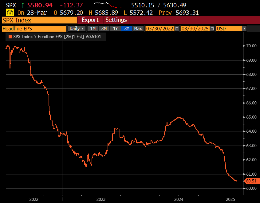
CY ‘25 estimates still project 10% earnings growth, but we should expect downward revisions after this earnings season. That could ultimately be constructive, as it sets a lower bar for earnings beats while also leaving room for potential upside surprises—especially if there’s progress in Trump’s tariff negotiations.

Regardless, we think earnings season will be difficult but how stocks react will be telling and something that needs to be monitored closely for clues.
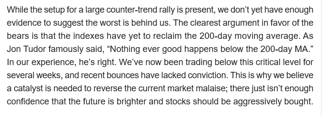
The next big potential catalyst is April 2nd, “Liberation Day.” Our contention has been that that the market needs a catalyst to add some conviction for any counter trend bounce. We seemingly had one on Monday with Trump being seemingly willing to make tariff concessions, taking the SPX back above the 200 day MA. This was quickly squashed by Trump flexing his muscles around tariffs escalation and the stock market did an abrupt about-face, hurling towards recent March lows.
Here is an excerpt from our 3/23 conclusion page for reference:
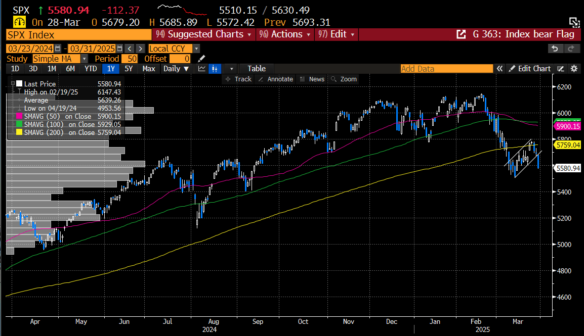
Friday’s close painted an ugly picture for the indexes. In our 3/23 report, we highlighted the bearish setup, and now the bear flag continuation patterns have all confirmed. We’ll dive deeper into this in our index analysis section, including our thoughts on potential downside targets.

The stock market is now contending with several concerning developments, including an impending death cross for the Technology ETF (XLK). There has been plenty of discussion about its implications for the market’s future trajectory. While these concerns are not unfounded, they are somewhat overstated. A death cross occurs when the 50-day moving average crosses below the 200-day moving average, a bearish technical signal—one that is now on the verge of materializing for XLK.
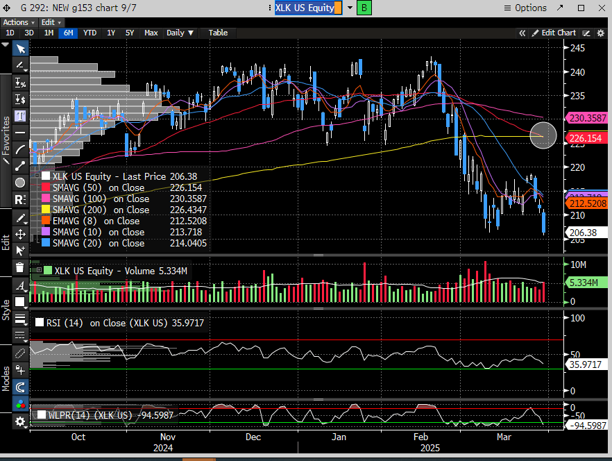
The last time this occurred was in January 2022, marking the market peak before the subsequent bear market, so the concern is understandable. The charts below highlight all death crosses over the past 20 years, along with the corresponding SPX declines and recovery times. While some instances led to significant additional downside, not all did. The most relevant comparison is likely 2018, when Trump was in office and similarly ramping up tariff rhetoric with China.
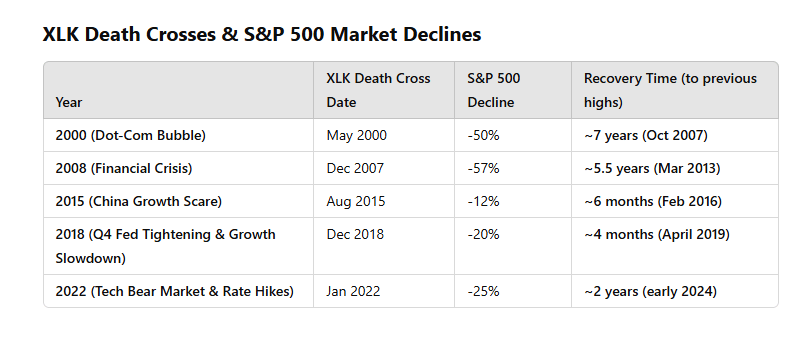
Using 2018 as a benchmark, it took 146 days to recover to all-time highs, with the peak-to-trough decline unfolding over 65 days. Notably, there were three counter-trend bounces before the market's final plunge.

The current market picture shows only one counter-trend bounce after a 27-day decline from the peak. By this measure, we are less than halfway through the duration compared to 2018. While it's important to note that market analogs don’t have to rhyme, this comparison provides perspective on where we stand, especially as we approach the likely death cross for the XLK. Of course, this is just one datapoint, so we shouldn’t place too much emphasis on it.

In addition to this, we’re introducing our Chart of the Week, which takes time to compile but aims to highlight interesting ways to view the market. This week’s chart reinforces the precarious position the stock market finds itself in, as indicated by the upcoming death cross for the XLK.
The chart below illustrates the percentage of SPX stocks below their 200-day moving average. As our analysis shows, the key threshold is around 50%. When the percentage falls below this level, the market often enters longer periods of contraction. However, the 50% mark is not a definitive indicator—there have been times when the market dipped below 50% but continued its bullish trend. To refine this analysis, we've added filters: the 30-day and 120-day EMAs, along with the MACD. Since 2018, almost every time the 50% threshold was crossed with a negative 30-day and 120-day EMA cross and a MACD below the zero line, the SPX experienced a notable decline. The duration of the decline typically depended on how quickly the market was washed out (low percentage of stocks >200-day) and whether the MACD crossed positive again, coupled with a reclaim of the 30-day EMA.
We understand this is a complex analysis, but decoding the market is never simple. Of the four instances since 2018, only one—April 2023—was a false signal. While the current signal could also prove false, we should know soon, as the 30-day EMA is now in close proximity, having rejected the index last week.
The key takeaway is that we are currently in the "danger zone." For the market to avoid further downside, it needs to recover quickly. If it doesn’t, historical patterns suggest we could face a prolonged period of difficulty and additional downside.

We fully recognize that there is no perfect signal that can predict the future with certainty. As always, we will take a holistic, evidence-driven approach to assess all available data and derive the most likely outcome.
Now, let's take a closer look at the other charts...
Subscribe to Premium to read the rest.
Become a paying subscriber of Premium to get access to this post and other subscriber-only content.
Upgrade

